
Unfiltered Thoughts
by Jessica Molina

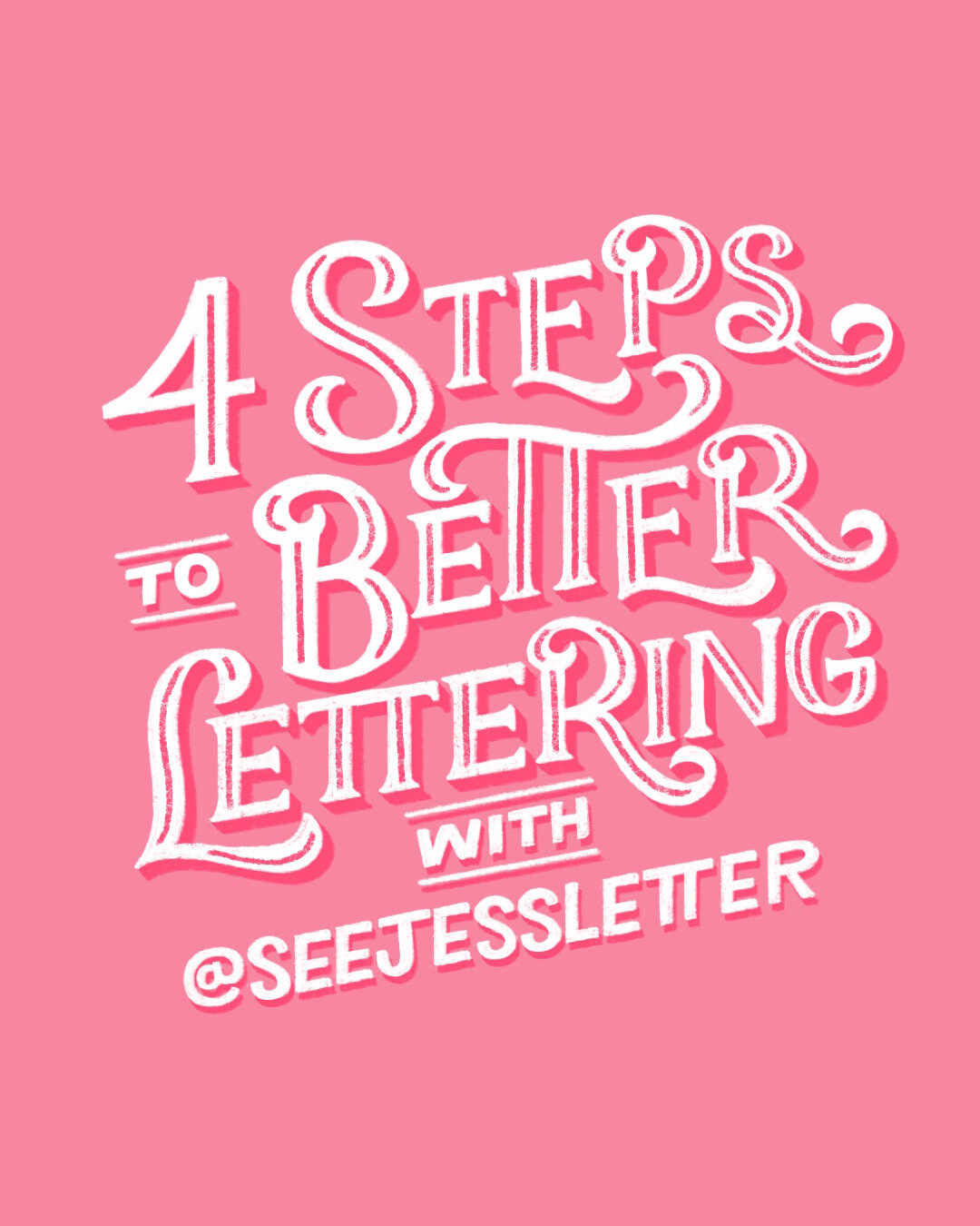
4 Steps to Better Lettering: Finalizing
In Step 3 of my 4 Steps to Better Lettering series, we went from simple thumbnail sketch to outlining the skeleton of our sketch, adding weight to the letters, and finalizing the sketch for the next phase.
In the fourth and final step of my series, I’m going to go over my process for adding color, shadows and highlights, and texture to make the finished artwork look polished and professional.

4 Steps to Better Lettering: Sketching
In Step 2 of my 4 Steps to Better Lettering series, I showed how you can use thumbnail sketches to quickly create multiple layouts to choose a composition for your final artwork.
In this next step, I’ll go over how to take your chosen thumbnail and build up to create the final composition.
4 Steps to Better Lettering: Thumbnails
In the first step of my 4 Steps to Better Lettering series, I explained how to establish hierarchy in your designs to create beautiful and visually interesting compositions.
In this next step, I’m going to explain how to quickly ideate on several layouts in order to get the best composition you can.

4 Steps to Better Lettering: Hierarchy
Designing beautiful lettering compositions can be mystifying to a beginner hand lettering artist. Seeing all these amazing artists on Instagram coming up with such seemingly perfect layouts can be just as intimidating as it is inspiring. So, how do you level up your lettering to make your compositions more visually interesting?